Brand Refresh: Storytea
UI/UX: Insightly App
Case Study: Bloom E-Commerce
Social Campaign: EcoSparks
Case Study: Six Flags Careers Page
✨ UX Case Study: Designing Career Pages for a Popular Amusement Park
By Asia Laney – UX Designer
📍 Challenge
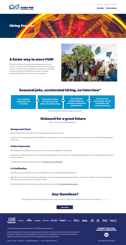
The amusement park’s corporate website had a dated, text-heavy careers section that made it difficult for users to explore job opportunities, understand company culture, or apply confidently. Bounce rates were high, and HR reported that many applicants dropped off before completing the application form.
Key Problems Identified:
Lack of visual appeal or brand alignment
Inadequate filtering/search for job openings
Non-responsive mobile layout
Minimal information about roles or work culture
Confusing navigation between job categories
🎯 Goal
To redesign the Careers section to:
Improve user engagement and completion of applications
Reflect the park’s fun and energetic brand
Create a mobile-friendly experience
Enable better filtering and discovery of roles
Build trust in the park as a great place to work
👥 Target Audience
High school/college students looking for seasonal or part-time work
Young professionals seeking full-time hospitality or operations roles
Technicians, engineers, and support staff in search of skilled roles
Mobile-first users applying on-the-go
📲 Device Focus
Mobile-first design (68% traffic from mobile)
Responsive experience across mobile, tablet, and desktop
No native apps – fully web-based
💡 Solution
✦ Phase 1: UI Design & Brand Alignment
Reimagined the UI with a bold, playful, and energetic aesthetic
Used vibrant colors, rounded components, and fun iconography
Integrated micro-interactions for engagement
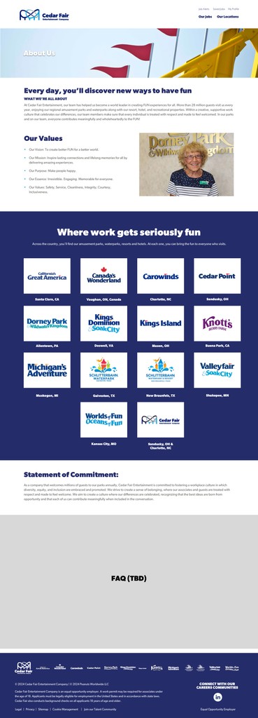
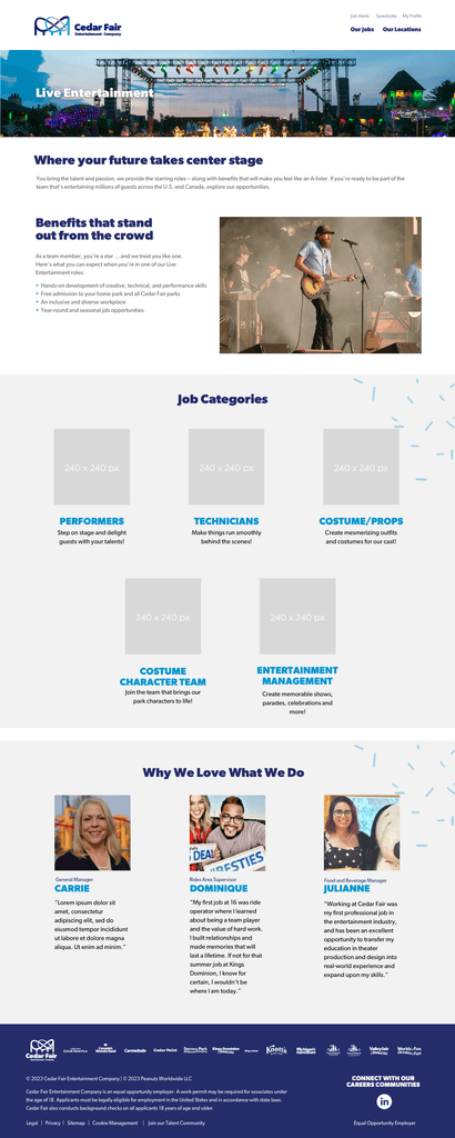
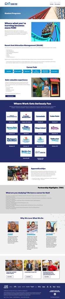
✦ Phase 2: Content & Layout Redesign
Restructured into four key areas:
Explore Careers
Departments
Life at the Park
Job Openings
Added visual storytelling with placeholders for photos and videos
✦ Phase 3: Application UX Improvements
Simplified application flow with visual step indicators
Enabled autosave, progress tracking, and mobile keyboard optimization
✦ Phase 4: Filtering & Navigation
Introduced faceted filters (role type, location, dept., experience)
Created sticky filter UI on mobile and collapsible desktop filters
🧠 Mistakes & Learning Moments
Overcomplicated Filters:
Initially created too many filters, which overwhelmed users.
→ Simplified to 5 core categories with tag-based subfilters.Video Overload:
Too many autoplay videos slowed mobile loading.
→ Replaced with lightweight highlight clips and lazy loading.
📊 Outcome
6 Months After Launch:
🔼 31% increase in completed applications
🔽 56% decrease in bounce rate
⭐ 4.2 / 5 average satisfaction score
👥 22% increase in qualified applicants
User Feedback Highlights:
“This doesn’t feel like a boring corporate page. I actually want to apply now.”
“Way easier to find summer jobs on my phone!”
🤔 What This Case Study Demonstrates
UI execution that reflects brand and user intent
Ability to iterate and refine based on testing
Strategic design for engagement and trust